Psylocke drawing process
As you probably already know, I just uploaded a new drawing of Psylocke on social media and here (it’s in the recent work section) I took some screenshots of the process that I will show you here.
This not a tutorial or anything. I just want to show you the process. I’m still need to learn a lot of this digital painting stuff.

Lineart. Off course there the sketching part first but I didn’t take a screenshot of that.
This was done in Clip Studio Paint. I didn’t work a lot on the line since this was meant to be a digital painting.

Shading
This is something new for me. I did it on the Rogue fanart I published yesterday. I always had the idea that this was a useless step but i think it’s because i thought it had to be really detailed, but now I see that doing it on this sketchy style is useful.
This was also made on Clip studio.

Rough Colors
This is the rough color. This I learned watching video tutorials of actual oil painting on youtube. Off course there is some different stuff you can do in digital like for instance, the background is in a separate layer. The rest is all a single layer, this is becuase I find it better if color mixed a little (not too much) After that i just soften with a blend brush
By the way this is done in Artrage

Finished Colors
Now, I could just say this is finished, but as you know I like to give my stuff more of a retro look. Even with Artrage that emulates real materials, this stuff still looks too modern and digital to me, so I exported it to PSD and start the reescaling and filtering in Photoshop

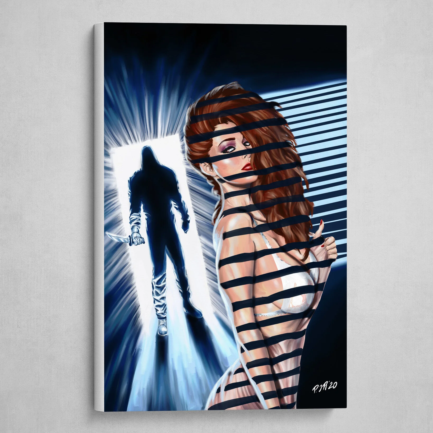
The finished piece
What I did in Photoshop is something that I saw in a tutorial for giving pictures a “vintage” look combined with some stuff I added (the same thing I did to the Rogue drawing)
The process is first to duplicate the drawing layer, applying a heavy gaussian blur to the duplicate, set the blending to soft light and opacity to 50%. Then add a layer fill with 50% gray and a noise filter. Set the layer to vivid light, and 50% opacity. After that i add a curves layer, edit that to my liking, then a photo filter layer (i set a warm filter at 30% or 40%), gradient map set to screen and a vibrance layer, to desaturate.
After that I add a paper texture. For this one I use one from an old card.
So that’s it. That last part is almost like a tutorial, LOL!
Like I said, I’m still learning how to do this digital painting stuff. Until now I very rarely did this kind of stuff, in part because I felt people didn’t like it as much as my regular comic style stuff. But I decided to go for it because I got kind of tired of the comic style.
That doesn’t mean I will stop doing that but I will be doing it less.
That’s all for today, thanks for reading.
Bye!