
Maneater
Probably some of you know that I was doing a comic called Maneater that I published online.
The comic is basically a couple of short stories about a creature that devours men. Here is the link on Tapas in case you want to read it https://tapas.io/series/Maneater1
Since there was some interest I decided to write a third story called Maneater of The SS. The idea was to release that one in a physical version.
But I wanted to know how much interest there is in it, since doing this comic will force me to limit the amount of commissions I could do. So I decided to a Twitter poll and see if people wanted me to just release the first two chapter together or releasing all three.
Now as I’m writing now, there is 85.4% of people interested in a version with three chapters together. That is all good but there is a problem. Out of 12.1 K followers I have only 153 voted.
That’s a problem because I know that means that less than those 153 are going to actually buy the comic. Something that will just make me waste time and money. You see, if like a 1000 people voted I could assume that at least a 100 could buy it.
I don’t think the situation is going to change so I made a decision:
There will not be a physical release of Maneater. At least not for English speakers (I could do one in my country because I know people that could publish it)
Chapter 3, Maneater of the SS, will get done and probably published online but I will have to make it shorter than planned. Also probably going to just do it whenever I feel like it and when I can make some time for it, so everyone that is waiting for it will have to wait more.
The most probable thing is that I will do some other projects I have in mind before continuing with Maneater.
Here are some of the designs I made for Maneater of The SS


Bye, thanks for reading.

Vintage comic book look tutorial
Learn how to give your art a Vintage comic book look with photoshop
This is something I have been wanting to do for some time. I did a video tutorial on how to achieve the printing effect with Photoshop, using the half tone filter. You can see it here and try to understand what I’m saying:
For people that prefer reading or just want an updated version here it is:
First off course, do your drawing. I use this color palette: https://www.deviantart.com/j-skipper/art/Official-DC-Comics-375-Color-Palette-454936613
For this example I will use a drawing I made a few months ago. Remember the file needs to be big. Mine is 7038 x 10335 pixels and 625 dpi.

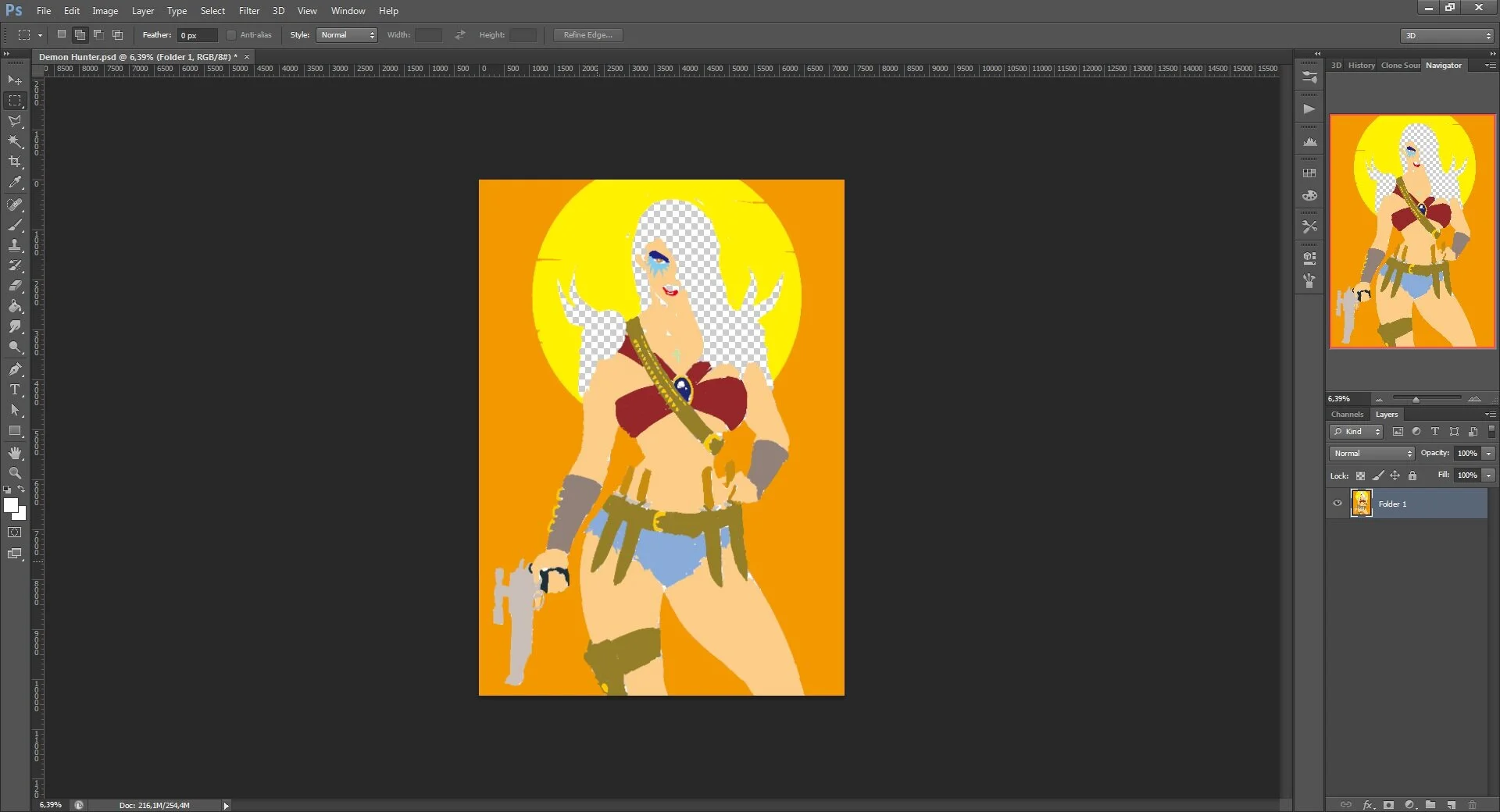
Now we are ready to get started. First you need to make your color layers (or folder like I have here) invisible so you only see your lineart.

Now go to select/ color range. Select all the white parts

Now go to channels and create a new channel from the selection. This will save it for later.

Click on that button
After you do that, deselect and go back to the layers panel. Now make the colors visible again and make the line art layer invisible

Now go back to select/color range and select the white parts

Notice that I changed the Fuzziness with this one
Now again go to the channels tab and create a new channel. Deselect after that

Now you have to selections saved
Next, delete your lineart. and all the white on your drawing (In my case is in a separate layer so I just delete that) and merge your color layers.
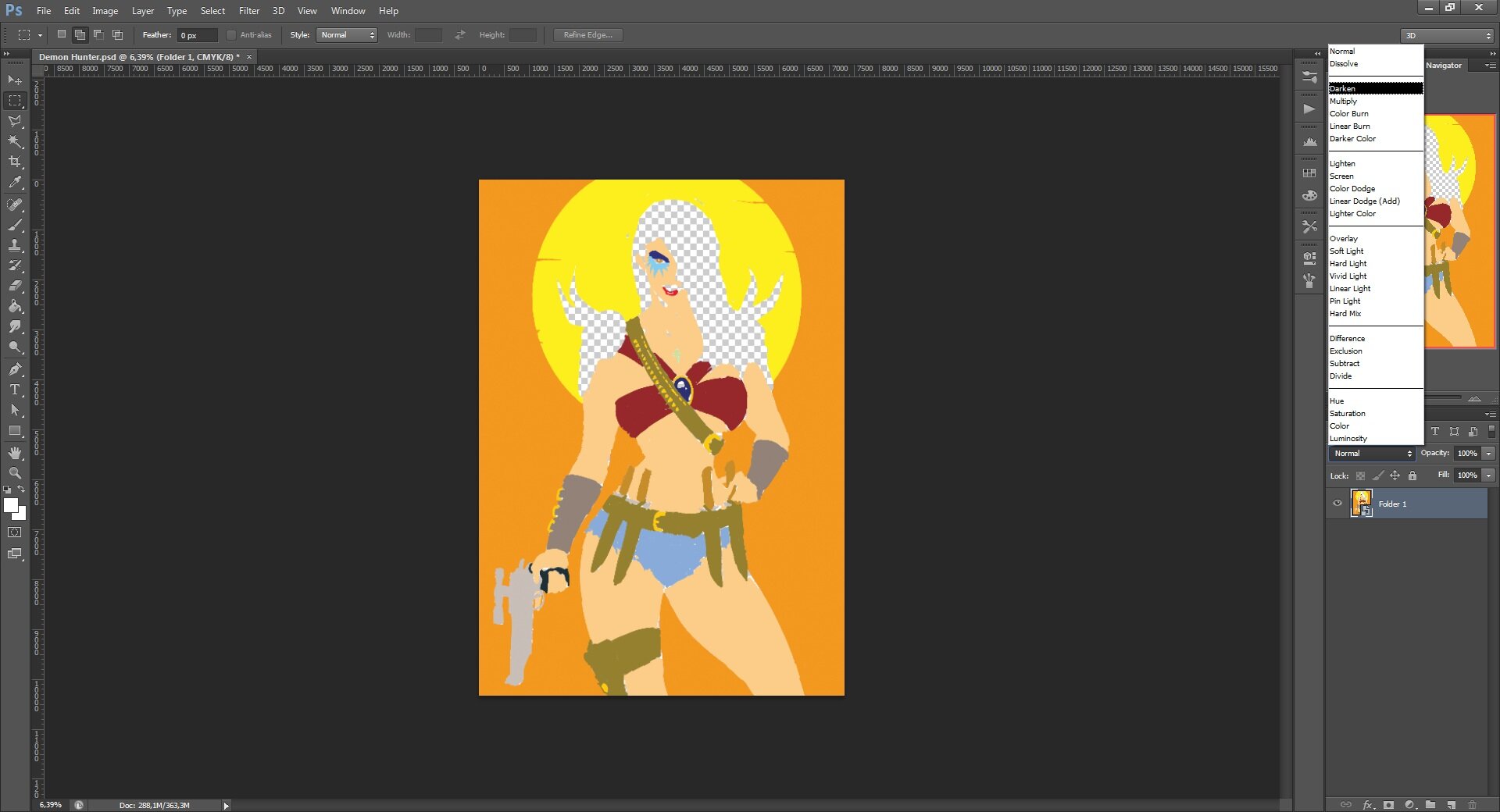
Now go to image / mode / CMYK color. After that make your color into a smart object. You can do this by right clicking over it.

Next set the layer to darken
After that, make 4 duplicates of the layer. Each one for each color channel, you can change the names to C, M, Y and K if you like. Not really necessary.


How it should look
Next go to each layer and right click on them. Go to Blending options and in the channels part, uncheck channels and only leave the channel corresponding to each layer (C for the C layer, M for the M layer and so on)


Having done that, what you do next is select the C layer and go to Filter / Pixelate / Color Halftone.

I usually set the radius to 4 or 6. Depends on how big you want the dots to be. If you want them to be visible on print, set it to 10 or more.
Do the same with the M and Y layers. There is no need to do it on the K layer.
Time to add some texture. What you need is a paper and an “ink” texture. What I did is to scan an old comic page that had a lot of black and with the clone stamp tool filled the whole image with black. Then set it to black and white.
I did something similar with the paper texture, scanned a page that had the paper more visible and with the clone stamp tool fill it all until it got like a blank page.
Now if you don’t feel like doing that you can just download my textures here:
First, add the paper texture. You can do that by drag and drop the file on the image or open and copy the file.
Move the paper texture layer to the bottom. (rescale the layer to fit the image if needed)

It’s already looking good. Now add the ink texture to the file, the same way. This time move it to top and duplicate it.
If you dragged and drop the file, rasterize the layer by right clicking on it and selecting the Rasterize layer option (there is probably a shortcut for this but I don’t know)

Now it’s time to use those channels that you created. First select the top layer, set it to darken and go to the channels tab. Press ctrl and click on the first channel you created. This will bring back the selection you made at the beginning. When selected press Delete. This will now be your new line art layer.
After that select the layer below. Set it to Vivid Light. You will now see the drawing. Go to the channels tab and select the second channel by pressing ctrl and left click. When selected press Delete. This is so this layer only affects the color parts.

It should be looking like this. If you zoom in the colors look more like they are supposed to.
Now you could just save an call it a day. But this still needs some tweaking.
The imperfections is what creates the illusion. You can tweak the brightness of the line art layer and make it like they used less ink for it.
Like this:

Before

After. I up the brightness. You may notice that some of the color is visible on the lineart. This is because is set to darken and it’s an important effect. It was something that happened in old comic books, so when coloring, remember to be a little sloppy
Now the other defect we want to emulate is the channels not be perfectly aligned. What you do is select each of the C, M and Y layers and move them. I usually move the C a little to the right, the M a little to the left and the Y a little up. Sometimes I go beyond a rotate some of them. Depends on how you imperfect you want it to be.
Also another thing that I do is set the opacity of the C, M, Y and K layers to 80% or less, depending on the effect I want. Sometimes I use different opacity for each one. Just have fun experiment with that

I moved and rotated the C, M and Y layers. Opacity values are: K = 50%, Y = 45%, M = 80%, C = 60%
And that’s it. Now you have a classic comic book style drawing.
Here is the final result:

Close up

Well I hope this will be helpful. I know that there are easier methods like using truegrit plugins or permanent press, but this is a cheaper way to achieve this.
Thanks for reading.
The 80’s look
Hello!
Is being some time but I finally I decided to do some writing here.
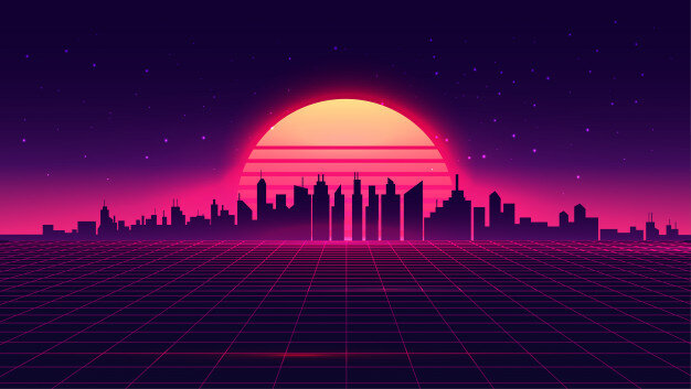
This is something I’ve been wanting to write for some time. Since I discover the whole “retrowave” scene around 2013, something that bothered me about the art coming from it is that it really didn’t look like stuff from the 80’s. That doesn’t mean I tough it was bad, some of it is good but the problem is that people, mainly young people that barely remember something from the 90’s and old people that don’t really remember the 80’s, think that this is the look of the 80’s

An example of “retrowave” art that I found on google.
Now this stuff like I said, it’s cool and it’s a good homage but it’s not the “80’s look”.
Here is the thing with the 80’s look or “aesthetic”. There isn’t just one. Like with other decades, you have a look of the early 80’s (that still has some late 70’s in it), a look for the mid 80’s and the late 80’s. This is in fashion, art, movies, music, etc. And even in those periods you have different stuff going on.
Examples of that are Patrick Nagel and Syd Brak. Both did work around the same time period but made very different stuff. While Nagel made more clean and simplified illustrations with acrylics (I think), Syd Brak made more realistic, airbrush stuff.
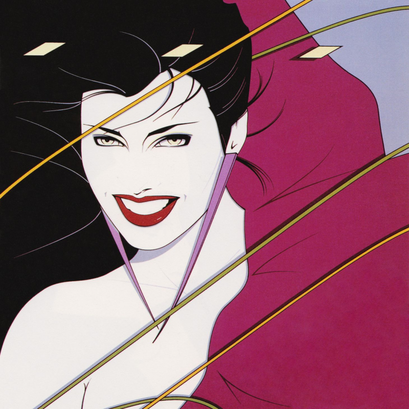
Patrick Nagel’s Rio cover for Duran Duran

Syd Brak’s “Electric Kiss”
Both of these have the 80’s look, but they are different. You won’t see a lot of Syd Brak inspired stuff, mainly because even with digital tools, it’s complicated (I know because I tried)
Then you have the Hajime Sorayama look. I have tried this stuff with both digital and traditional tools. It is complicated to get that chrome right. Someone that really nails that style is Bern Foster
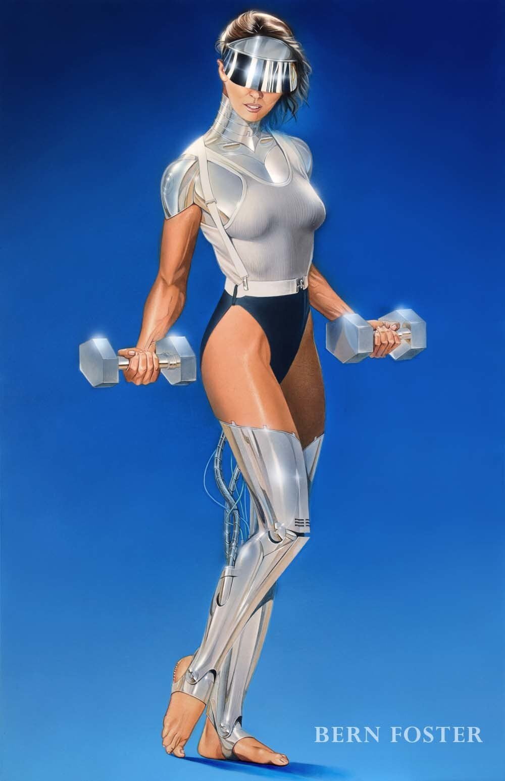
Bern Foster.

Hajime Sorayama
You also have Anime that is really popular now. With 80’s anime you have a lot of different styles, but the main thing is Cell Shading. Some artist that do this really well are David Liu, Dennis Pulido.

David Liu

Dennis Pulido
And After that you have commercial art, like for ads and stuff. This is something that people really don’t pay that much attention to, but there is some really cool stuff. Chrome & Lightning on tumblr has a lot of that stuff there and on instagram. He also made some Illustrations on that style

Apparently a pencil sharpener ad that Chrome & Lighting scanned

In a perfect world, by Chrome & Lightning
And there is other stuff but this will take forever.
What you are wondering then is “How do I get the 80’s look in my art” And I say, well, depends on what style you want to do. If you want to go for a Nagel look, you need to have a clean and smooth linework, use simple and mostly flat colors. If you want to go for something more like Airbrush art like Syd Brak or many other airbrush artists, well you have several options.
You can go traditional, that would be the more expensive and hard way but you will get the better results on the end.
You can go digital and use some tricks to get a more airbrush look or just use the digital airbrush (Like I did) It’s harder but you can get good results from that too.
For Anime look, like I said before the key is Cell shading. Use very little or none gradients at all. Bright colors are used here, avoid cold tones.
One of the key elements on this is to AVOID THE DIGITAL LOOK. What do I mean by this? Your work, if its done digital, must look as traditional as possible. With stuff like Nagel’s you can get away with it, but not that much with Anime and realistic work.
The other one is like I said with anime to avoid cold tones. Use warmer colors or pastel colors (Like Mizucat does)
Another important thing is to document on stuff like clothing, hairstyles and technology. If you do let’s say a girl with an iphone, with one side of her head shaved and modern clothing is not going to look 80’s at all.
Adding some aging also helps, paper texture and print like effects look cool. Like I said before, avoid the digital look.
I think that is all. If there is something else you want to know, ask me on the comments below.
Bye, thanks for reading.

Truly outrageous
Like I mentioned in my previous post, there is a lot of people that often think that some of my work is some character from Jem and the Holograms. It is understandable, I like to draw girls with big hair and sometimes I give them unnatural colors like pink or blue. The thing is, most of the time I’m not taking inspiration from Jem, but more from Hair Metal bands or just models from the 80’s. Some Examples of this inspirations (haven’t made drawings of this ones, yet):


I could fill pages of pics of big hair 80’s ladies but that is not what you came for (I think) so here some of the actual Jem Fanart I’ve drawn:

Pizzazz. Traditional drawing I made in 2011.

Stormer drawing from 2018.

Jem in Anime Style, 2018

Pizzazz in Anime style also from 2018

Another Pizzazz this one from 2019. The “cromy” logo is something only kids from Argentina are going to get.

Action Jem that I posted last week.
I think that is all the Jem fanart. There is another one but is more of a Saint Seiya fanart and one of those that I need to explain to people.
Ok, so here is some stuff that is often though of being jem fanart:

“30 Minutes”

“Face” This one I did during a Livestream on youtube (Good dog press channel)

“Gail” Another one also made during a Livestream (also on Good dog press channel)

“Dawn”

Quick drawing that I made recently.

“Geronimo’s Cadillac” I don’t remember if someone mentioned Jem on this one, but it’s probable.

“Satin” I don’t know what I was thinking but I know It wasn’t Jem.
Ok, That’s all for today.
Bye and thank you for reading.

Nagel and Me
One of the things that people often say about my drawings is that they reminded them to some comic artist that I don’t know or that it looks like Patrick Nagel stuff (or something from Jem and the Holograms, but that is a conversation for another time) .
In case you don’t know about Patrick Nagel, he was an American artist in the 80’s that drew stuff like this:

Cover of Duran Duran’s Rio Album.
Now, here is the thing. I didn’t really got into Nagel’s work until 2017.
Like I said in my first post, I started working professionally in 2010 (before that I just did stuff for free) doing mostly comics. The style I was doing back then was more similar to what I used to the styles of comic artists in my country (or at least I tried to do similar stuff) So I was doing more suff like this:
Panel of Berserker, from 2015
You can check it out here: https://tapas.io/series/Berserker
So, what happened was that I wanted to do pages faster and I remembered that a couple of years before that, I was working on a simpler style (this was pre digital era) The first of those drawings was this:

Pencil drawing from 2012
I tough of just going full anime style, since that was how I use to draw back in my “amateur” days (will post some of those old comics one day) but I was too much into wanting to draw like the people I admire, the more realistic artists like Ernesto Garcia Seijas, so I didn’t go that route. Decided to just work on this style.

Ernesto Garcia Seijas drawing of El Negro Blanco characters. A comic that was published in a popular newspaper in Argentina in the late 80’s and early 90’s (also published in Italy and some stuff on Heavy Metal in the US)
What are the changes that I did? I simplified the eyelashes on women faces, went from a lot, to just 3 and eventually to 1 (sometimes i do a couple more if I feel like it) Eliminated expression lines in women. Simplified the eyebrows, the hair and changed the way I did hair shading ( not a lot, more like cleaned it up a little). Also stopped doing cross hatching and went for more black shadows.
Now during that time I was starting doing 80’s inspired stuff for fun more often. I went looking for 80’s art and it was there that I found Patrick Nagel. I already saw some of his stuff before off course but never paid attention to it. So I decided to try something in that style.

This one is called “La Epoca de Sentir” I used it for a banner of a Facebook group of 80’s nostalgia.
After that I took some stuff from him and added it to my drawings.
Finally I did drew a couple of episodes of berserker on that more simplified style but it isn’t published yet. In time I went back to doing some of the stuff I dropped back then.
That’s pretty much it. Nagel wasn’t that much of an influence as some people believe. It was more like “This is similar to what I’m doing, let’s see what I can take from it”
Next post will probably the Jem thing.
Bye and thanks for reading.


Drawings that need explanation
Sometimes I do stuff that people from the US and other first world countries don’t really get., so let me explain some of it.
First is this one

This one is inspired by old pencil case art from the 80’s and early 90’s. You see back then if your parents had the money, they would buy you a nice pencil case for school. Some had stuff like thermometer or a mini piano (those were popular with girls)

You can see the “Green Pine” logo. These were made in China I believe. Sometimes they had anime drawings.

Mini Piano cases
The car you see in the drawing is a Renault Fuego. It was popular in the 80’s in Argentina.

Scan from an Ad.
This one wasn’t the first or the last of this kinds of drawing. Later that year I made this one:

This one was inspired by the video of the song “Fascinated” by Company B
Previous to these 2 there is this one (the first of this kind):
The explanation to this one is a little more complicated.
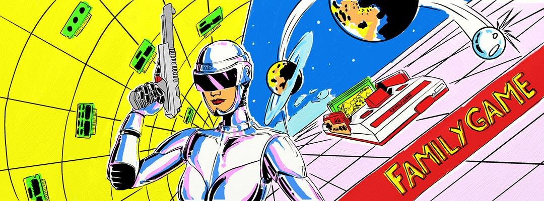
You probably are already familiar to the NES. Back in 1983, Nintendo released a console in Japan called “Family Computer” (famicom) That on the US and Europe was called the NES (with some changes to the cartridge slot and console aesthetics) Well the Taiwanese, decided to clone the Famicom, and made lots of different models for it and also some NES clones and sold it in countries were Nintendo didn’t sold. That is how in Argentina, in the early 90’s we got to play NES games. Here the Famicom and NES clones are known as “Family Game”. This is because the first clones came with that name but there was a lot of different brands and models. This drawing is one of many fanarts I made of the “Family Game”
The red and white thing is the console

The “NTDEC” Family Game console. Very popular and sought after in Argentina.
You can also see a cartridge in it, that is Super Bros 10 Kung Fu Mari (or Mario 10 for short) That is a hack of Jackie Chan’s Action Kung Fu. They replaced Jackie for Mario. There is a lot of Mario Hacks made by the Taiwanese in the 90’s.

Super bros 10 cartridges.
On the Left you can see some green and black things flying. Those are cartridge PCB’s. You see, pirate carts plastic often breaked so it was normal for kids in Argentina to have loose PCB’s of games to play.
The robot woman is from the box of some NES clones models called “NASA”

Picture of the one I own.
You may also recognize her from other drawings I made of her such as this one:

This one was from a fake set of cards I made. That will be explained in another post.
That is all for today. Thanks for reading and don’t forget to check out the print shop.
Bye

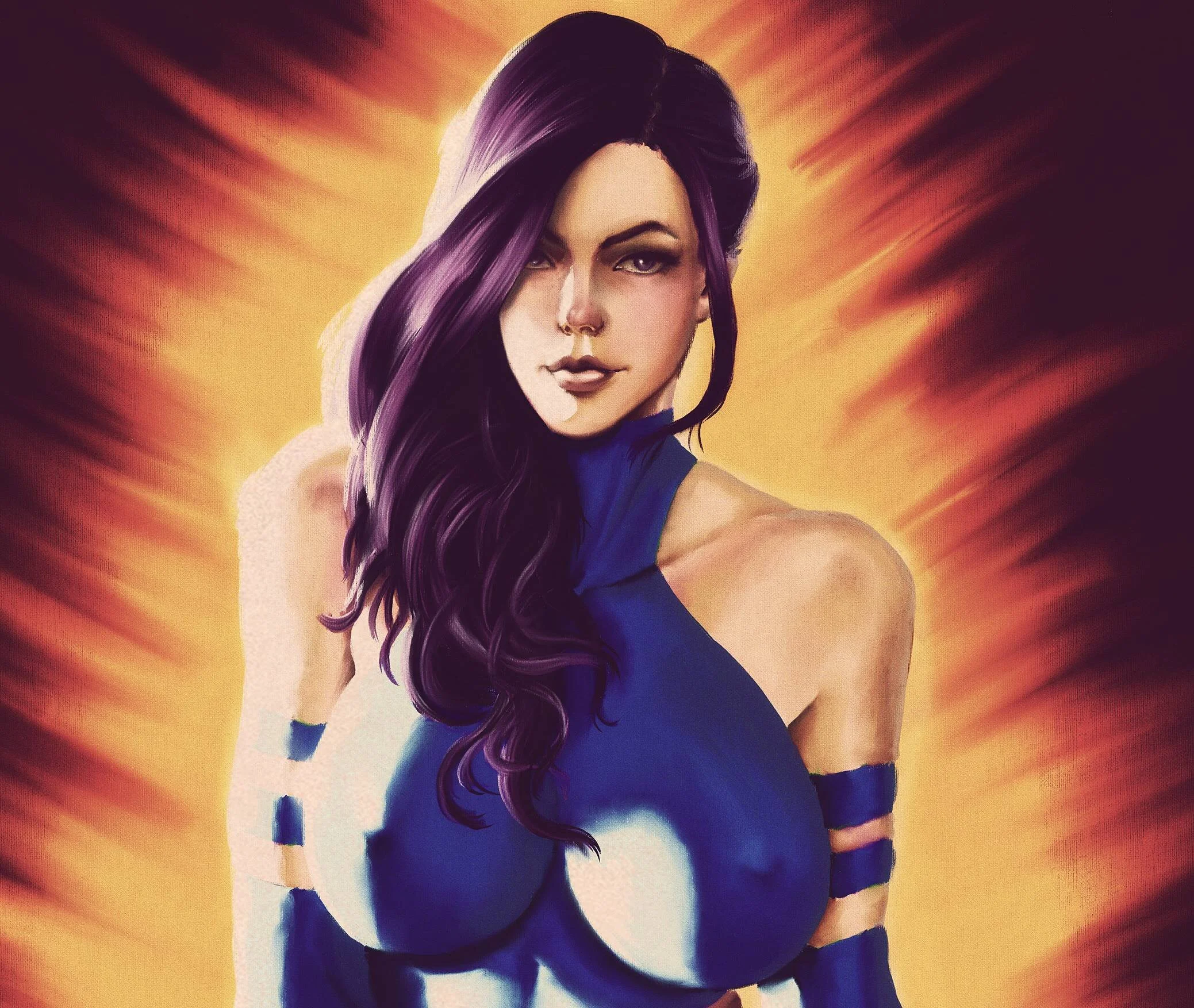
Psylocke drawing process
As you probably already know, I just uploaded a new drawing of Psylocke on social media and here (it’s in the recent work section) I took some screenshots of the process that I will show you here.
This not a tutorial or anything. I just want to show you the process. I’m still need to learn a lot of this digital painting stuff.

Lineart. Off course there the sketching part first but I didn’t take a screenshot of that.
This was done in Clip Studio Paint. I didn’t work a lot on the line since this was meant to be a digital painting.

Shading
This is something new for me. I did it on the Rogue fanart I published yesterday. I always had the idea that this was a useless step but i think it’s because i thought it had to be really detailed, but now I see that doing it on this sketchy style is useful.
This was also made on Clip studio.

Rough Colors
This is the rough color. This I learned watching video tutorials of actual oil painting on youtube. Off course there is some different stuff you can do in digital like for instance, the background is in a separate layer. The rest is all a single layer, this is becuase I find it better if color mixed a little (not too much) After that i just soften with a blend brush
By the way this is done in Artrage

Finished Colors
Now, I could just say this is finished, but as you know I like to give my stuff more of a retro look. Even with Artrage that emulates real materials, this stuff still looks too modern and digital to me, so I exported it to PSD and start the reescaling and filtering in Photoshop

The finished piece
What I did in Photoshop is something that I saw in a tutorial for giving pictures a “vintage” look combined with some stuff I added (the same thing I did to the Rogue drawing)
The process is first to duplicate the drawing layer, applying a heavy gaussian blur to the duplicate, set the blending to soft light and opacity to 50%. Then add a layer fill with 50% gray and a noise filter. Set the layer to vivid light, and 50% opacity. After that i add a curves layer, edit that to my liking, then a photo filter layer (i set a warm filter at 30% or 40%), gradient map set to screen and a vibrance layer, to desaturate.
After that I add a paper texture. For this one I use one from an old card.
So that’s it. That last part is almost like a tutorial, LOL!
Like I said, I’m still learning how to do this digital painting stuff. Until now I very rarely did this kind of stuff, in part because I felt people didn’t like it as much as my regular comic style stuff. But I decided to go for it because I got kind of tired of the comic style.
That doesn’t mean I will stop doing that but I will be doing it less.
That’s all for today, thanks for reading.
Bye!
Hello!
Welcome to my webpage and blog.
I don’t know how often I will post here since people tend to be more on social media than webpages.
So, for people that doesn’t know me and because I don’t have an “about” page here, let me tell you some stuff about me: I’ve been working as a professional comic artist since 2010. All really small indie stuff, some unpublished. Also spent 10 years on deviantart posting stuff that nobody saw. Only got people notice when I started posting on Social Media. I was working on a comic called “Berserker” when I started my facebook page. The comic entered a hiatus, so I took the time to work on doing what I wanted to do, that is 80’s style stuff.
Since 80’s stuff is very popular I guess it was a good decision. Also the comicsgate movement, was also good for me, since it gather a lot of people that wanted something more similar to the old comic book art. Ever since i started to gain a lot followers, specially on twitter. A lot of them because of my “controversial” Captain Marvel redesing

Where are her organs? LOL
Some people got really mad about it, and it was fun to watch all the reactions. Also got some of the same stuff for other drawings like the Mia Khalifa as Ms Marvel and the recent sexy indian girl from Land o Lakes.
I also drew a comic called Cyborg USA, that is currently on indiegogo, also worked on another indiegogo called Seven Legions (made a Manga style art for that one) and currently working on my own comic, Maneater, that is available on Tapas, Webtoons and Instagram.

Cover of the first chapter of Maneater :“The black Guy and The Girl”
Currently working on Chapter 3.
So I think that is about it.
Probably will post more stuff here. Even if people don’t read it.
Ok, don’t forget to check out the print shop, let me know if there is any artwork that you like to be available for it.
I also have a Patreon, probably should add a link to it on the main page. I don’t know, maybe I can set up some kind of subscription thing here. Will see.
Ok, bye!