The 80’s look
Hello!
Is being some time but I finally I decided to do some writing here.
This is something I’ve been wanting to write for some time. Since I discover the whole “retrowave” scene around 2013, something that bothered me about the art coming from it is that it really didn’t look like stuff from the 80’s. That doesn’t mean I tough it was bad, some of it is good but the problem is that people, mainly young people that barely remember something from the 90’s and old people that don’t really remember the 80’s, think that this is the look of the 80’s

An example of “retrowave” art that I found on google.
Now this stuff like I said, it’s cool and it’s a good homage but it’s not the “80’s look”.
Here is the thing with the 80’s look or “aesthetic”. There isn’t just one. Like with other decades, you have a look of the early 80’s (that still has some late 70’s in it), a look for the mid 80’s and the late 80’s. This is in fashion, art, movies, music, etc. And even in those periods you have different stuff going on.
Examples of that are Patrick Nagel and Syd Brak. Both did work around the same time period but made very different stuff. While Nagel made more clean and simplified illustrations with acrylics (I think), Syd Brak made more realistic, airbrush stuff.
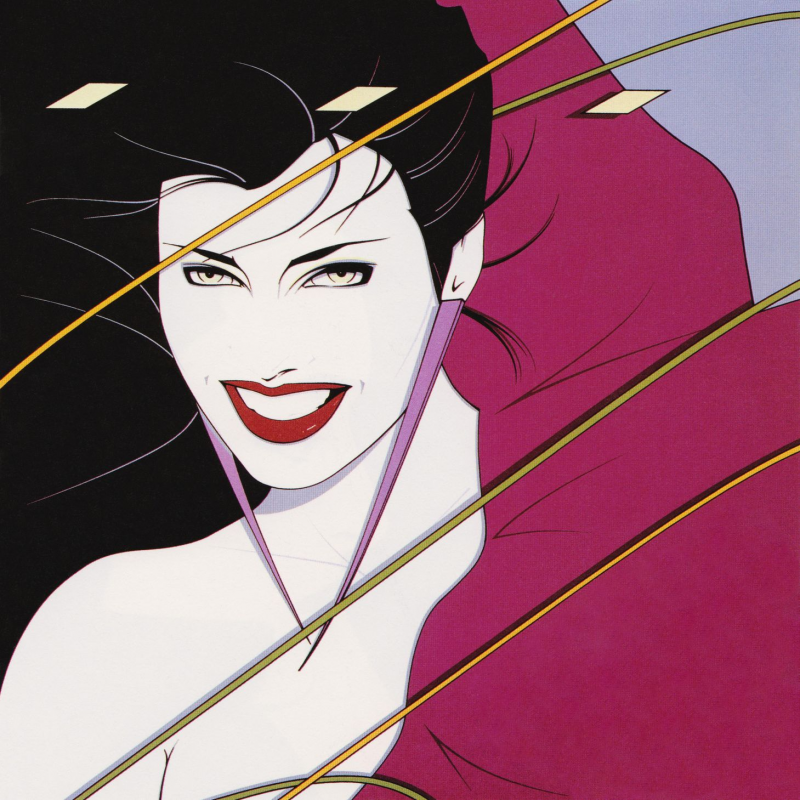
Patrick Nagel’s Rio cover for Duran Duran

Syd Brak’s “Electric Kiss”
Both of these have the 80’s look, but they are different. You won’t see a lot of Syd Brak inspired stuff, mainly because even with digital tools, it’s complicated (I know because I tried)
Then you have the Hajime Sorayama look. I have tried this stuff with both digital and traditional tools. It is complicated to get that chrome right. Someone that really nails that style is Bern Foster
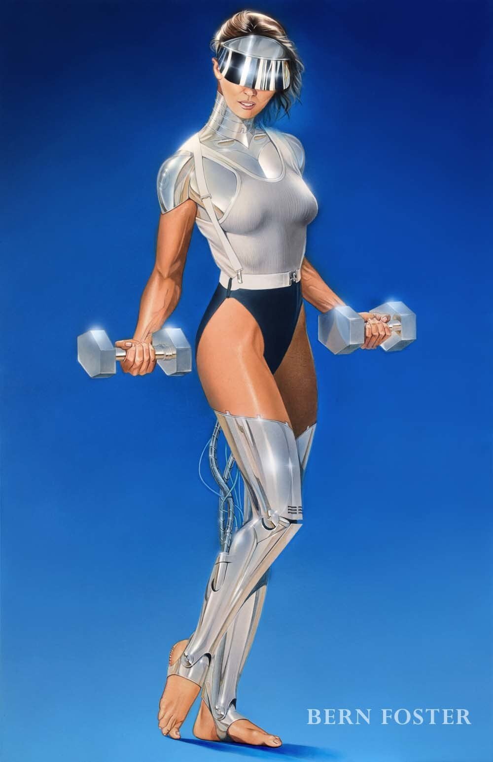
Bern Foster.

Hajime Sorayama
You also have Anime that is really popular now. With 80’s anime you have a lot of different styles, but the main thing is Cell Shading. Some artist that do this really well are David Liu, Dennis Pulido.

David Liu

Dennis Pulido
And After that you have commercial art, like for ads and stuff. This is something that people really don’t pay that much attention to, but there is some really cool stuff. Chrome & Lightning on tumblr has a lot of that stuff there and on instagram. He also made some Illustrations on that style

Apparently a pencil sharpener ad that Chrome & Lighting scanned

In a perfect world, by Chrome & Lightning
And there is other stuff but this will take forever.
What you are wondering then is “How do I get the 80’s look in my art” And I say, well, depends on what style you want to do. If you want to go for a Nagel look, you need to have a clean and smooth linework, use simple and mostly flat colors. If you want to go for something more like Airbrush art like Syd Brak or many other airbrush artists, well you have several options.
You can go traditional, that would be the more expensive and hard way but you will get the better results on the end.
You can go digital and use some tricks to get a more airbrush look or just use the digital airbrush (Like I did) It’s harder but you can get good results from that too.
For Anime look, like I said before the key is Cell shading. Use very little or none gradients at all. Bright colors are used here, avoid cold tones.
One of the key elements on this is to AVOID THE DIGITAL LOOK. What do I mean by this? Your work, if its done digital, must look as traditional as possible. With stuff like Nagel’s you can get away with it, but not that much with Anime and realistic work.
The other one is like I said with anime to avoid cold tones. Use warmer colors or pastel colors (Like Mizucat does)
Another important thing is to document on stuff like clothing, hairstyles and technology. If you do let’s say a girl with an iphone, with one side of her head shaved and modern clothing is not going to look 80’s at all.
Adding some aging also helps, paper texture and print like effects look cool. Like I said before, avoid the digital look.
I think that is all. If there is something else you want to know, ask me on the comments below.
Bye, thanks for reading.